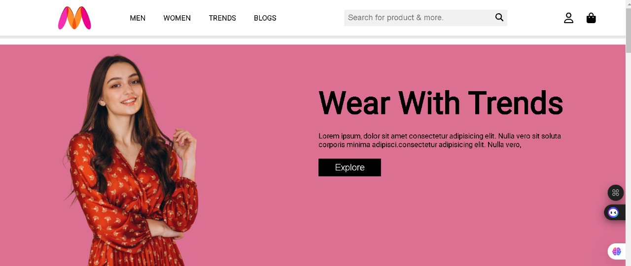
E-commerce storefront
A storefront-style site emphasizing product discovery, promotional bands, and a purchase-oriented layout — tuned so marketing content and catalog browsing coexist without visual noise.
Context & goals
E-commerce landing pages often fail when everything screams at the same volume: hero banners, sale ribbons, and product grids compete for attention. I structured this storefront around a clear visual ladder — primary hero, supporting promo strip, then dense catalog rows — so scanning patterns feel natural on both desktop and mobile.
UX & layout decisions
Navigation stays shallow: shoppers can jump to featured collections without hunting through nested menus. Product tiles reuse one card system with fixed image aspect ratios so rows align cleanly even when titles differ in length. Sale or “new” labels are constrained to a small badge system so they read as metadata, not as separate layout islands.
Breakpoints focus on readable line lengths and tap targets rather than shrinking text to fit; on narrow screens, grids collapse progressively instead of squeezing four cramped columns.
What I shipped
- Landing composition: hero, promotional bands, and curated product shelves
- Reusable product cards with consistent spacing, price styling, and CTA placement
- Responsive navigation patterns (collapse-friendly header and scrollable rails where needed)
- Static assets and scripts suitable for GitHub Pages without server configuration
- Performance-minded image usage: correct dimensions and lazy-friendly markup patterns
Tech & constraints
HTML, CSS, JavaScript, and responsive techniques with a static host. The constraint reinforced good habits: no hidden dependency on server rendering, so the page must be meaningful even before scripts execute.
Results & lessons
The site reads as intentional merchandising rather than a template dump. I learned to judge quality by squint tests: if hierarchy survives when blurred, spacing and contrast are probably right. Next steps would wire a real inventory source, add search/filter UI, and instrument basic analytics events for funnel learning.